CASE STUDY · MARITIME HVAC · 2022–2023
Intuitive HVAC management system for the cruise ship cabins
Cruise-ship reception desks turn over constantly. Every rotation meant training somebody new on Datapan's cabin climate system. A cost the company carried on every vessel it sold. The brief was to design that training away.
01 / THE CHALLENGE
Bad UI needs constant training with staff turnover
Datapan builds HVAC systems for cruise ships. UNIapp is the software layer for cabins, reachable from anywhere on board, installed on its first 170-cabin vessel by mid-2022.
The focus: maximum intuitiveness, so that reception needs as little training as possible when staff change.
02 / THE UMUX-LITE TEST
Status labels looked like buttons to users
It was quite obvious to me that users would have a hard time using the system with status labels and buttons looking the same. So we went straight into a redesign, then scheduled interviews and usability tests to check the improvement.
The usability test: 7 participants, thirty minutes each.
“Imagine you are a member of the hotel staff on a cruise ship. An older guest calls reception from cabin 237 and asks for help increasing the temperature in his room, because it is too cold.”
WHAT I WATCHED FOR
- Can they raise the temperature?
- Can they correctly read the states the interface is showing them?
- Can they tell which actions are available to them?
- Can they explain “Basic setpoint” and “Setpoint range +/−” in their own words?
WHAT THE EXISTING INTERFACE DID
- All six tried to click a status indicator as though it were a button — most often the “OFF” chip on the bathroom floor heater.
- One clicked every status square on the screen, because every one of them looked pressable.
- Editing was gated behind a toggle called Remote that two participants never found unaided.
- Five never realised that switching it on also locks the guest out of their own cabin panel.
- Nobody could reliably explain the difference between Actual, Local and Basic setpoint.
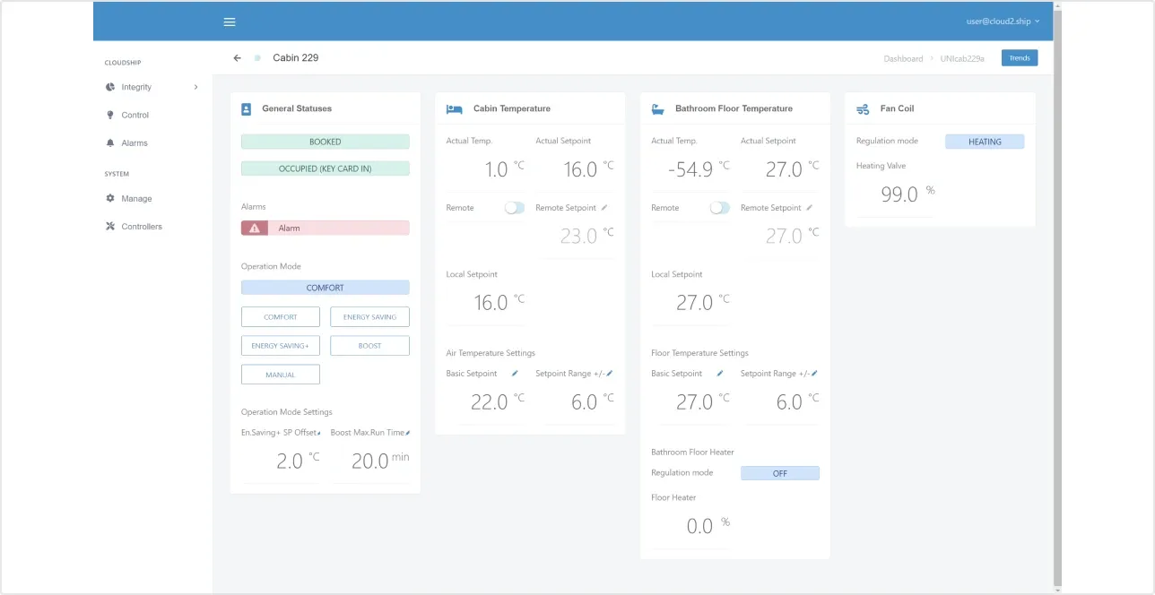
The existing interface. Editing gated behind a pen icon two participants never found, and status chips that all testers tried to press.
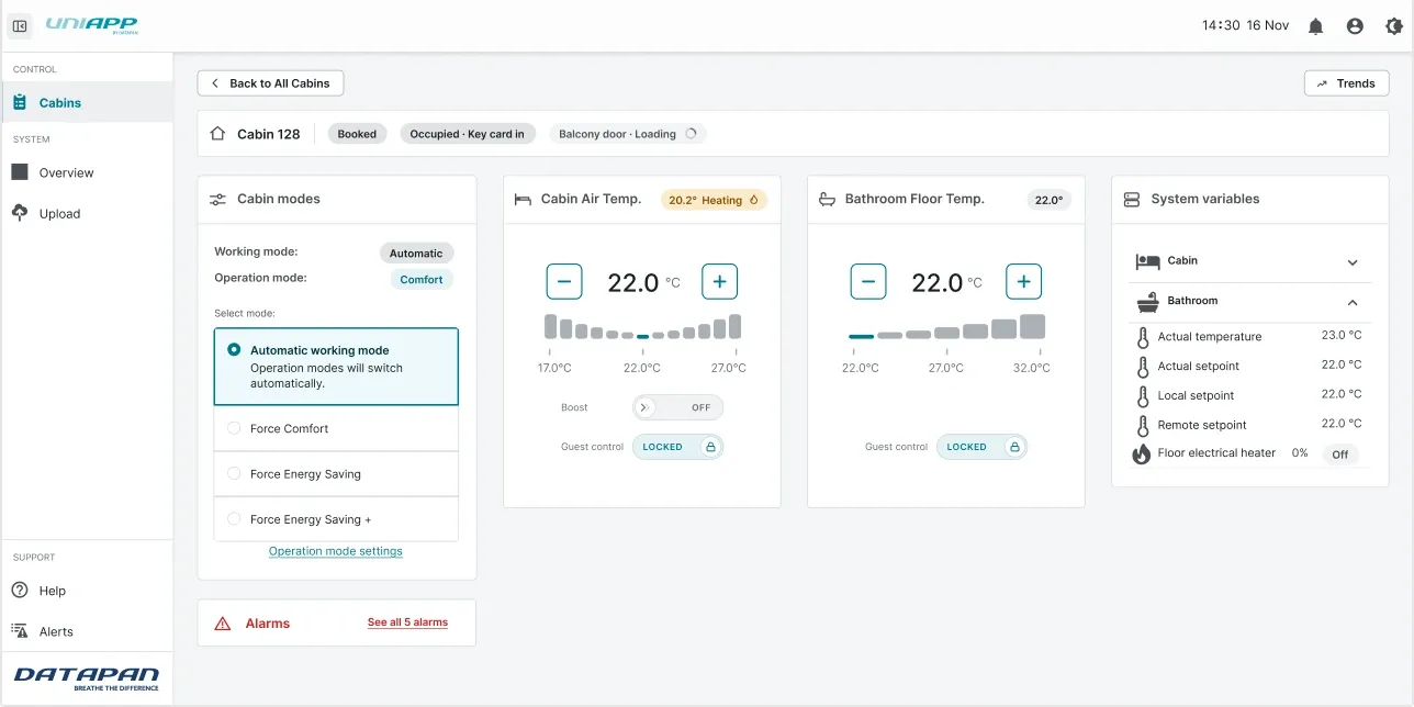
The redesign with intuitive indication of available actions.
03 / THE FORK
UMUX-Lite score: lifted from 70.8 to 92.9
UMUX-Lite is a simplified scoring system to quantify and compare ease of use between two systems — here, the existing UI and the redesign.
Testers rate two statements from 1 (strongly disagree) to 7 (strongly agree): the system's capabilities meet my requirements, and the system is easy to use.
OLD UI
SUS-EQUIV 68.9
70.8
TEXT UI
SUS-EQUIV 81.7
90.5
SIMPLE UI
SUS-EQUIV 83.3
92.9
UMUX-LITE SCORE (0–100) · UMUX-LITE = ((Q1−1)+(Q2−1)) / 12 × 100 · SUS-EQUIV = (UMUX-LITE × 0.65) + 22.9 · n = 7
A 2.4-point gap between two prototypes across 7 people is a rounding error, so the choice between the two redesigns came down to preference.
On the redesigns every participant adjusted the temperature immediately, without any status-label clicks.
04 / THE OPERATOR VIEW
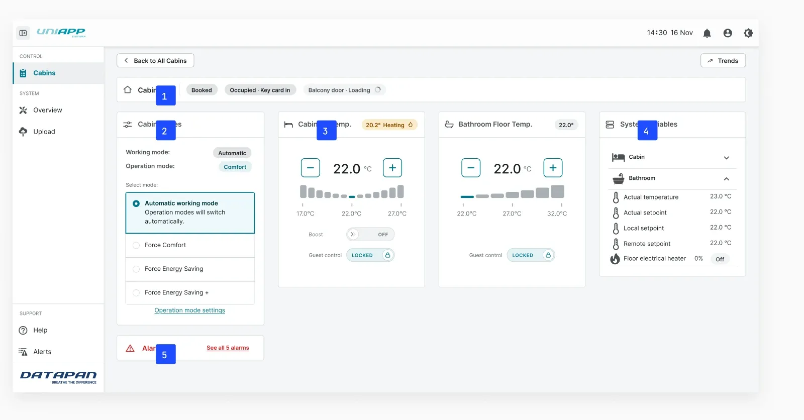
What a ventilation officer needs on one screen
-
Occupancy before temperature
Booked, occupied, key-card and balcony-door state sit above everything — they explain why the cabin is behaving the way it is.
-
Automatic by default
Modes switch themselves. The operator forces an override only when a guest calls, and the current mode is always named.
-
One number, two buttons
The setpoint is the biggest thing on the card. Range and boost sit underneath as constraints, not controls to hunt for.
-
Engineering data, kept aside
Actual vs. local vs. remote setpoints still matter for debugging — so they live in a panel, not in the primary flow.
-
Alarms are a count, not a feed
Five active alarms is the fact an officer needs at 2am. The list is one tap away.
05 / THE CONTROL PANEL
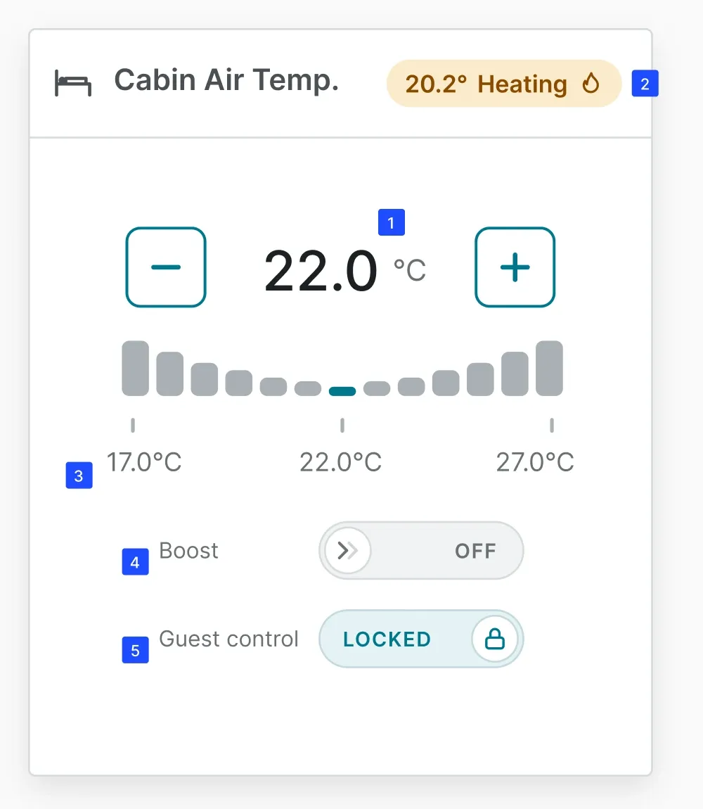
One number, two buttons
-
The setpoint
The largest object on the card, with the only two things you can do to it either side. Nothing to enable first.
-
Current state
The header says what the system is doing right now — heating, cooling, or nothing — beside the actual temperature.
-
The allowed range
A constraint set by the officer, not a control. How far a guest may move the temperature from their own cabin panel.
-
Boost
The most confusing element in testing: it boosts heating or cooling depending on what the system is already doing. Two participants did not read it as pressable, so it gained a tooltip.
-
Guest control
Renamed mid-study — participants read the original “Lock” as “reset the settings”. Everyone after the change read it correctly.
06 / THE AUTOMATION LOGIC
Even a new hire technician can jump right in
-
Documentation in the UI
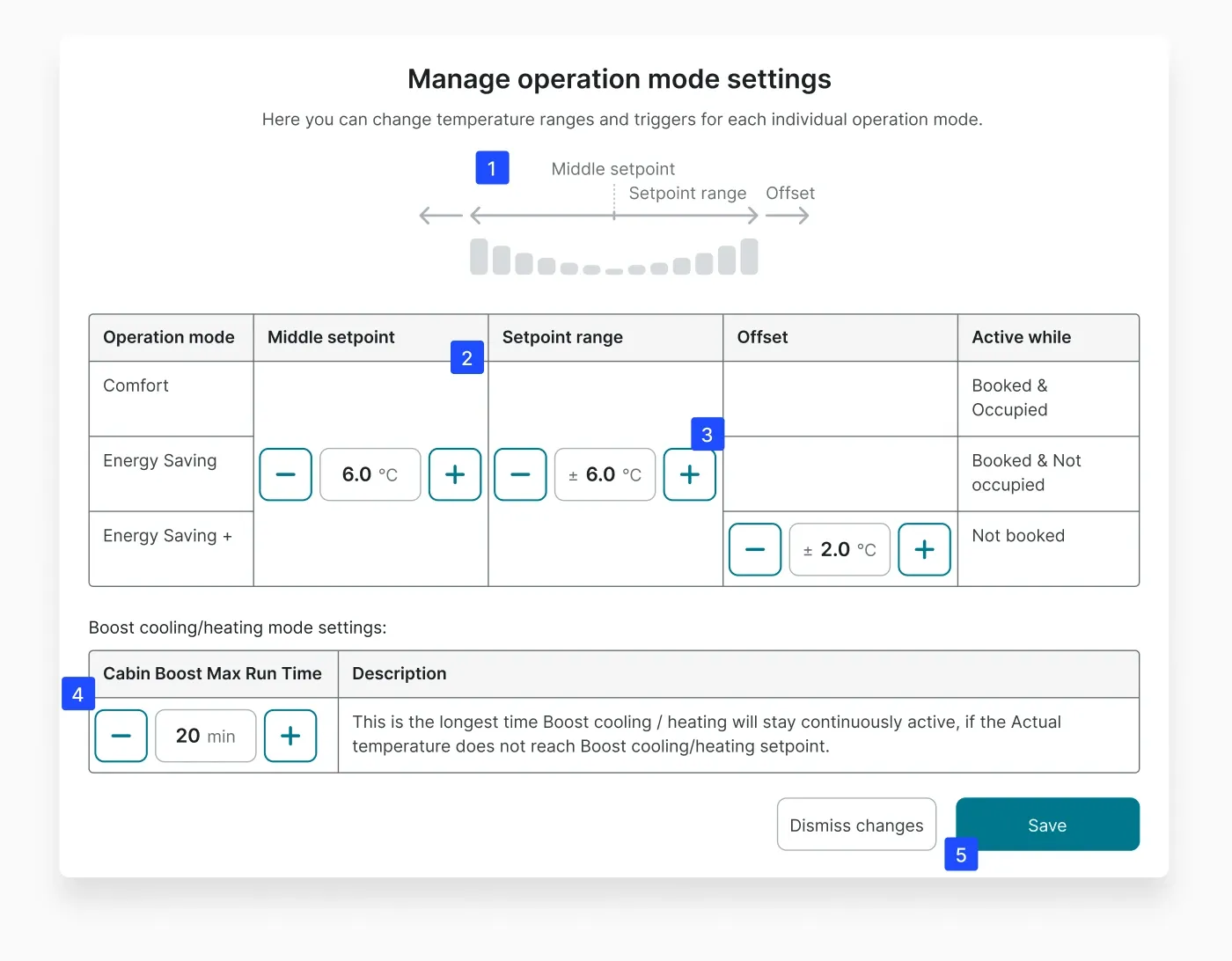
The officer would normally open a manual for these settings. The diagram explains middle setpoint, range and offset in place, so the reference lives where the decision is made.
-
One band, three modes
Middle setpoint and setpoint range are single values shared by every mode — merged cells, not repeated rows. Comfort centres on the band; the saving modes derive from it.
-
Steppers, not text fields
Every value moves in fixed steps with its unit attached. The hardware has limits, so the interface enforces them — a free-text field invites someone to type 220 instead of 22.
-
A ceiling on Boost
The longest Boost will run if a cabin never reaches its target. A stuck valve or an open balcony door cannot heat a cabin all night.
-
Nothing auto-applies
Dismiss and Save are equal width and equally reachable. Leaving the modal changes nothing until the officer says so.
07 / MANAGING THE WHOLE SHIP
One officer, up to 200 cabins, mid-sailing
-
Bulk action bar
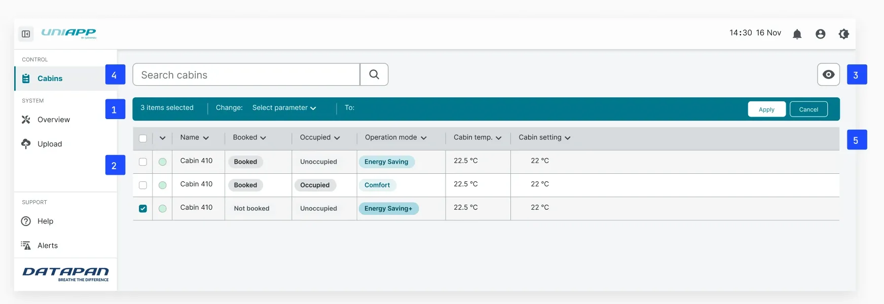
Selecting cabins turns the toolbar into the action — one parameter, one value, applied across everything selected. Apply and Cancel sit on the bar itself, so the scope of a change never leaves the screen.
-
Item selector
A checkbox per row, and one in the header for the whole vessel. Nothing destructive appears until something is selected.
-
Column visibility
The table carries more columns than any one shift needs. An eye icon opens the list, with starred columns as a shortcut back to a working set.
-
Search bar
Cabins are found by name rather than scrolled to. A guest gives reception a cabin number, not a position in a list.
-
Column filters
Every header sorts and filters in place — booked, occupied, operation mode, temperature out of range.
08 / STANDARDS
Following the OpenBridge standard

Cruise ship bridges are starting to use OpenBridge, the maritime design standard shared across radar, alarm and machinery systems. Officers recognise the patterns from other bridge systems, and recognition is the cheapest route to confidence.
I used OpenBridge components or patterns where it was sensible.
ADOPTED
Patterns the standard had already solved, so I did not redraw them.
- Table, sorting and column control
- Top bar and page navigation
- Buttons and steppers
- Alarm card and severity colours
- Status pills
DESIGNED TO MATCH
HVAC-specific patterns the standard does not cover.
- Operation modes and the mode card
- Boost, and its direction states
- Guest-control locking
- Setpoint band and offset table
- Temperature state readout
09 / WHAT WAS NOT IDEAL
Only one true receptionist in the test group
Budget limits meant only one test user was an actual cruise-ship receptionist. We tested with six less tech-savvy Datapan employees who had not yet seen the existing UI or the redesigns.
The one participant with genuine shipboard experience flagged that locking a guest out of their own panel would draw complaints — “I paid to control my own cabin”.
10 / WHERE IT LANDED
Shipped, and measurably more intuitive
70.8 → 92.9
UMUX-Lite. Baseline n=6, redesigns n=7
I have no post-deployment data from crews at sea, so every number here comes from prototype testing.
MY ROLE